Home again today. I could have made it to work, but a call to the office determined that I could stay home if I wanted. My pick-up is all cleaned off and dug out, ready to hit the plowed roads at 6:30 AM tomorrow. So I’ve had a pleasant day of exercising my body via shoveling, and my brain via reading and writing. I wrote one new chapter of Documenting America, and expanded one old one to full length. I also did some research for future chapters. The word count now stands at 23,300, so I’m edging close to done. I’ve done half of my daily Wesley research, read the couple of writing blogs I follow, followed stocks for a while. I’m ready for something else. Oh, yes, I’ve also begun research for my next Suite101 article.

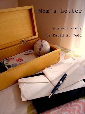
A few days ago I posted two trial covers for my short story, “Mom’s Letter”, asking people to weigh in on which one looked better. I also posted a notice about this at the writer’s forums at Suite101. Not may people commented on the blog (only one, in fact), but many of my friend and colleagues from Suite101 dropped by, looked at the two, then went back to the Suite forums and posted comments. I also received comments from my wife and son. The verdict is…
…both covers are good (one Suite woman described both as “gorgeous”), but cover one was better than cover two. The comments were about 14:1 in favor of cover one. The only negatives about cover one concerned the font. Some thought the letters in the word “Mom’s” and my name seemed “squooshed” together. Some saw the font as “non-professional”. I must confess that I didn’t see the squooshing, and still don’t after the comments. When I first looked at the font it did look non-professional to me. However, after dwelling on it a bit, I think it’s the right font for the story. It looks like it came off a typewriter—an old typewriter—which fits the story with it’s span of forty years and attention to memories.
I was going to re-shoot the second one, see if I could do better with the lighting, but have changed my mind. With such a large margin between the two, it’s doubtful that better lighting on two will overturn the verdict in favor of one. Perhaps the cover designer might want to tweak the letter spacing, perhaps not. I’m pleased with it the way it is. All it needs, IMHO, is the words “a short story” added somewhere, so that potential buyers are not led astray, and it’s good to go.
One of my Suite commenters said she’d been in many editorial meetings where covers were discussed and had never seen such a lopsided agreement between competing covers. That may be due to the fact that the photographer for one is accomplished in that pursuit, while the photographer for two (meaning me) is not, and has no sense of artistic layout, lighting, spacing, etc.
The good thing is, with e-self-publishing, it’s easy to change the cover. Short story not selling? Early reviews say the cover stinks? Change it. If that doesn’t work change it again. If that doesn’t work change it again. Change it daily if you want. It’s not a question of pulling a print run; it’s a question of deleting a file and uploading a new one. How cool is that.
So, I’m inching closer to publishing this. Maybe I can get it done by the weekend. My schedule will require me to wait until early March if I don’t get it done by then. Must next see if the story needs any tweaking. Amazingly, I found one typo in it on Tuesday, and a “that” I think I can delete. Recent beta readers have suggested a tweak or two, which I’ll evaluate. Then, I have to finish research into how to upload the file and list it on Kindle. Then I’ll have to see about other publishing platforms. Nice, discrete tasks all in a row.