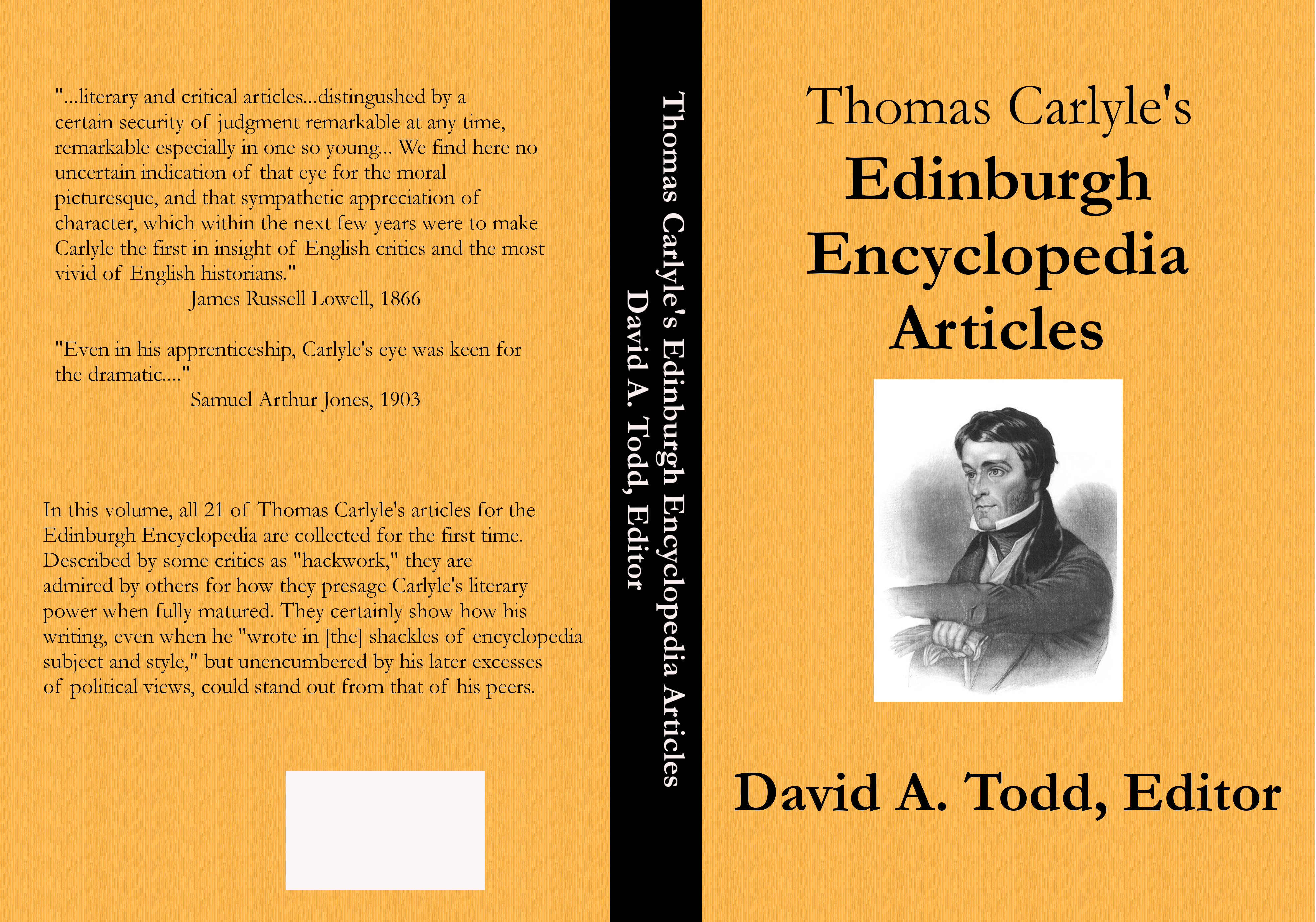
I now know enough about using G.I.M.P. to create book covers to be considered dangerous. Last night, on coming home from the office, since the wife was resting and there was no immediate need on either of our parts for supper, I went straight to The Dungeon and began tweaking my two latest book covers. The one for Thomas Carlyle’s Edinburgh Encyclopedia Articles about killed me to have to do, since it had been accepted on first submission. But the glaring typo right on the front cover had to be fixed. I also decided to add some quotation marks to the back cover.
I made the tweaks, saved it in three different file formats, and resubmitted it to CreateSpace. At the same time I resubmitted the interior of the book, which needed two typos corrected and a minor tweak to the margins. So here’s the final cover for TCEEA.
After that, I went back to the cover for The Gutter Chronicles. Even though it’s an e-book cover (at this point, at least) and thus should be easier than a print book cover, I’m finding it harder. The problem is the text I’m pasting over the photo of the computer monitor needs to be put in a double perspective view. It’s tilted back from bottom to top and from right to left. This looks like it should be easy with G.I.M.P. You just select the text layer, call for Transform Tools > Perspective from the menu, grab the four corners of the layers one at time, layer by layer, and click Transform.
The problem is, my text is in several layers. This is because the normal spacing between lines of text in a word processor (and the G.I.M.P. text entering window is a simple word processor) is too great for them to look good. Printers call this “leading,” and so I put each major line of text into separate layers (text boxes) and move them closer together than a word processor will allow. But then, in doing the double perspective work, I need to do that with each layer of text.
That wouldn’t be a problem, I imagine, if I understood what I’m doing. when I grab the corners and move them, a table of six numbers changes, the numbers going from zeroes to other numbers, some positive, some negative. The numbers are to five significant digits, and control of the mouse is such that getting the edges of the text in the right place is difficult. Fortunately you can undo and re-do to your heart’s content.
Of the five text layers, only one seems to be in exactly the right spot. So I wrote down the six numbers for that one, and went to work on the others, but the mouse control to get the numbers on those other layers to be perfect is impossible. And you can’t just click on the table and enter the perspective numbers you want. Thus, I have five layers of text, one at a perfect perspective and four at odd perspectives. Here’s where the cover stands now.
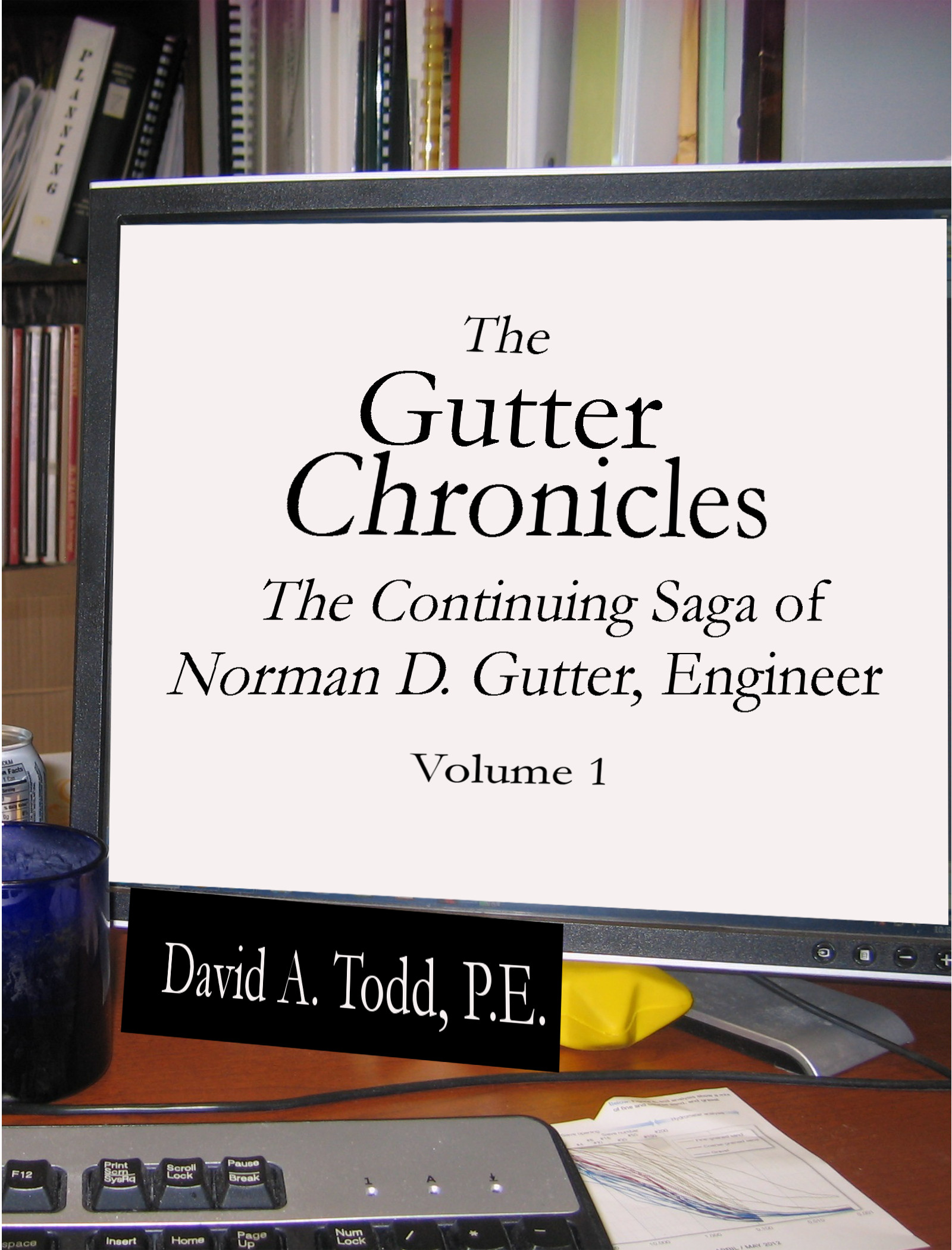
You can see how the lines of text aren’t all at the right perspective. My name on the “nameplate” is good, but the others are all askew. I’m sure G.I.M.P. has a way to handle that. There are Path commands, which perhaps allows one layer to have the same attributes of another layer. Maybe there’s a way to get into that table of perspective numbers and enter them, and—poof—the layer will go to exactly the right perspective. I’m still learning, and have much, much more to learn.
But, for now, this is the cover. And, I just sold a copy! I posted the new cover and link to the Kindle version on Facebook, and one of the women in our Accounting Department bought one. We’ll see where it goes from here. I must get back to doing some writing, and set covers aside for a while, but more work in G.I.M.P. is not far away.
I’m happy you are developing your graphic design skills. The covers look good.