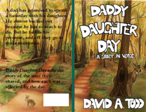
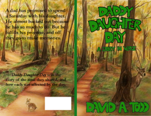
 Okay, I think I’m going to turn over my cover for Daddy-Daughter Day to someone. Jake has helped me with it so far. We looked at it today to discuss some tweaks. I showed him how some of his letters needed tweaking, to which he agreed. He showed me how some of my color work didn’t quite make the grade, which I could see after he pointed it out. He then said if I would send him the G.I.M.P. file he would see if he could upload it into Photoshop and take care of those few things. He also saw where some of the letters he drew were not on a straight line, which he wanted to fix.
 He says he will have it done in about a day. He’s taking a few days of vacation for a stay-cation, with family in, but said he’d have plenty of time to do this. This means I might be able to upload the book to CreateSpace tomorrow, and order a proof copy pretty quick, assuming the cover size is correct. I think I did that correctly.
Turning this over to someone is both a good feeling and a not so good feeling. It feels as if I’m failing at learning how to do something. Yet at the same time it’s a relief not to have to deal with it.
Will I ever learn graphic arts programs enough to where I understand what I’m doing and feel comfortable doing it? I doubt it.
The two photos in this file are the two book covers I’m considering, after the guy’s tweaking. I posted them to Facebook and received comments. The green font one was ahead, but a decent but not comfortable margin. I’m anxious to get this done.
I’ve heard it said that green is a color to avoid in covers because it’s easily lost among other colors. Not saying that’s true, but it would steer me away from using the green cover. The white stands out more on your background to me, but white’s another color that’s easily lost in the white space on a webpage. Overall it’s a nice cover, just giving you some thoughts to think about. Best of luck with either one!