
As I’ve mentioned before on the blog, I hate dealing with book covers. I should just hire this done, to someone with more artistic talents who is also learned in graphic arts programs. Alas, I don’t want to have my writing activities indebted to the family budget, so I’m on a pay-as-you-go basis. Right now, that means that, with a few exceptions, I make my own covers.
But I hate it. That also means I have to use a free graphics arts program, rather than expensive programs such as Photoshop or Illustrator. That means G.I.M.P. I believe I’ve also written about hating G.I.M.P. I hate it because it is difficult to use. That’s partly because I don’t understand some of the graphic arts terms, but also because the documentation is poor. I’ve found some third-party help with G.I.M.P., such as article, or videos on YouTube. But, to be honest, they all do their thing by assuming the reader/watcher know more than I do. They’ll say “after you’ve selected the layer” or some such thing, assuming I know how to select a layer, when I don’t. It’s maddening.

In terms of creating the cover for a print book, however, I’m starting to get more comfortable with the whole process. I didn’t say I was proficient, or that I enjoyed it, or was good at it; just that I was more comfortable. I have come to learn the basic steps needed: figure the exact size of the cover wrap; create a canvas that size; create a “size overall” layer; create a front cover layer; create a back cover layer; create a spine box layer; position these where they need to go; add words and graphics to each. Piece of cake, right?
Several times I’ve gotten something to work, but didn’t really know how I did it, and thus couldn’t replicate it for the next cover, or even for another part of the cover I was working on. For the last cover I asked one of our landscape architects at work to help me to understand what I had to do to move layers into the right place: centered, left, right, whatever. We got it to work, but didn’t really know why—or at least I didn’t.
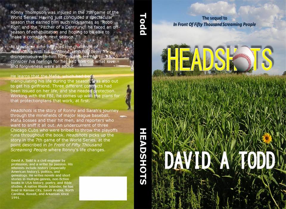
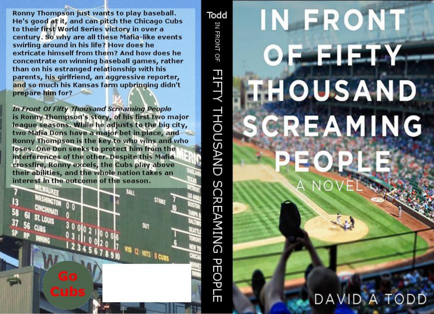
Last Friday, I was working on the cover for the print edition of Headshots. I want to have it out for the end of baseball season, which is fast approaching. I had begun this cover about three weeks ago, but got bogged down and left it. I started on the noon hour, but had little luck, so was continuing into the afternoon (guess I’ll charge that time to vacation). I went to the break room for coffee, and ran into our corporate CADD trainer, who I supervise. He asked how it was going, and I said “Great if I could figure out how to use G.I.M.P.” He said that was something he could help me with.
Back to my office we went, and I said I was having trouble 1) placing layers where I want them, which G.I.M.P. calls “Align” or “Distribute”; and 2) filling a layer with color. He showed me how to do the latter, though I don’t think I remember it today; I’ll see at noon. But he couldn’t figure out the G.I.M.P. commands for alignment. He’s a wiz at graphic arts, so I didn’t feel too bad.
But while he was there, I tried something. I wanted to center the “spine box” layer on the “overall size” layer. That assures that the spine will be in the right place. I tried something. I made the Align command active. Then I chose “Active Layer” as the target. Now, the program doesn’t say that drop down menu is to select the target, but when you hover the mouse over it, the words “Select target” appear. Then I went to the list of layers on a side panel and chose “Overall size”. Then I moved the mouse over the spine box on the canvas and clicked it. At that point the arrows in Alignment command box went from grayed-out to active. Aha! I clicked center, and poof! the spine box moved to the center of the overall size, just like magic.
I quickly wrote those steps out, so I wouldn’t forget them. Then I did “undo” several times, until the spine box was back out of position (I saved the file first). I looked at the list of instructions I’d written, and followed them. Again, the spine box moved to the right place. It didn’t seem like magic that time. It seemed almost logical, and replicatable.
I have a long way to go on creating covers. The graphic arts program is the mechanics. I’m slowly but surely getting to know that. The whole artistic thing—what looks good, what looks professional, what will attract a buyer to a book—is something I have to still work on. But I’m getting there. I’m almost at the point of knowing enough to be dangerous.
Good job on the cover!
Thanks, Veronica. I will soon know enough to be dangerous.