For the last week I’ve done no writing. Not a word. For more than a week, actually. Nor have I done anything about marketing my writing. Instead, I’ve read; I’ve rested; I’ve watched television; I’ve worked a little on genealogy. Oh, and this past weekend I spent a few hours filing and culling my writing papers.
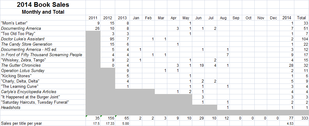
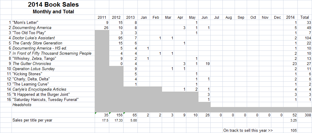
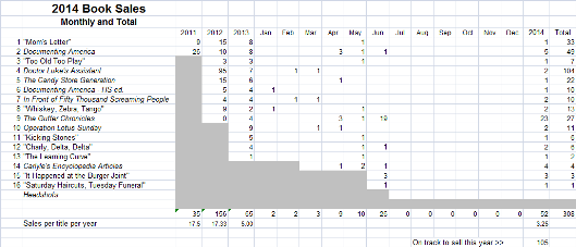
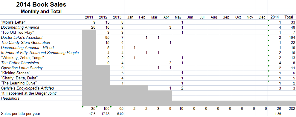
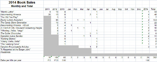
So when do I start writing again? I’m not sure I’m ready yet. I’m still reeling from the lack of sales. Sales looked so promising in April through July. After months of selling two or three copies a month, I was up to 10 to 12 copies per month. Then Amazon started the Kindle Unlimited book borrowing service in July. None of my books are in that. Coincidentally, about that time, my book sales dried up to nothing. I went from July 30 to August 28 selling not one book on Kindle. On August 28 I dropped the price of my first baseball/Mafia novel to $0.99, and sold seven copies in two days. I hoped this would spur sales of the sequel, but unfortunately it did not. I sold one copy of that.
In the face of those sales results, it’s difficult to carry on. I don’t know that Kindle Unlimited caused people to quit buying my books because they can borrow books less expensively elsewhere. I don’t particularly want to pull my books from all other sales channels so that they can be exclusive to Amazon and thus in KU. But the timing of my sales drop and the launch of KU are, if not effect and cause, quite coincidental. This past weekend I had my first two sales in September, on back-to-back days. It’s a welcome development, which I hope will continue. Alas, my pessimistic side says it won’t.
So, I need to decide what to do. Do I write? Do I promote and see what happens? Do I publish what I have ready? Do I finish what’s in the pipeline and publish those? All of those things require work and sacrifice. Publishing means creating covers, the thought of which makes me ill. I either need to buck up and do it or hire it done with money I don’t have. I could also opt for ugly, generic covers that don’t attract readers. Since my fancier covers aren’t attracting readers, maybe it won’t make a difference.
The book that’s closest to being done and ready to publish is my poetry book, Father Daughter Day. It’s done, just needing e-book and print book formatting and a cover. I say it’s done. I had hoped to add one more poem to it. I’ve worked on that poem, but nothing has come to me that seems good. The book could go out without it. Maybe this week I’ll take the drafts of the poem and work on it, see if I can finish it. Then next week I could do the formatting. As for a cover, I have an idea of exactly what I want, but I can’t produce it. It would take an artist, or at least a graphic artist to combine elements into an attractive cover.
I’m mainly thinking out loud here. Possibly finishing FDD is the way I’ll go, though maybe not. Stay tuned.
